The first element of this study concentrates on materiality - this is effectively the media used in an artwork, and the artwork originating from experimentation of the media used, as opposed to a pre conceived idea. The topic relates strongly to abstract expressionism, such as works by Jackson Pollock, whose work is about the material qualities of the paint, and does not represent any sort of form. This style of working can be used to push boundaries of what the medium of paint is capable of. It can be used to explore innovative ways of creating art, rather than using traditional media in traditional styles. Of course, experimenting with materials is not limited to paint - it could be applied to anything, and anything can be used to create art.

Number 8, Jackson Pollock, 1949
I am interested in looking at this concept within the medium of photography and 'painting with light'. The word photography actually comes from two Greek words: phos, meaning light, and graphis, meaning drawing. Light is the most important element of photography, as it is in the capturing of this that images are created. Painting with light allows the photographer to create abstract images and manipulate the image in the process of capturing the photograph. The first known works which used this technique were Man Ray's Space Writing series. Man Ray was notorious for pushing boundaries within photography. It is also interesting that although Pollock's work is abstract expressionist, he was in fact influenced in his early works (of the 1930's) by certain aspects of the Surrealist movement, and also in his 'action paintings', which he started in 1947.


Left - right: 'The Bull' by Pablo Picasso, 1949, part of the 'Space Writing' series by Man Ray, 1937
I stumbled upon this untitled, anonymous image as part of an online blog.
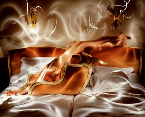 I love the idea of 'painting with light' and I think this image captures this very well. The swirling patterns created by the light create an abstract expressionist style, but the forms are still visable. There was no information available on this image, other than that it is a photograph, but it appears to me as though it is either a composition or an existing image which has been photographed using a long exposure with various lights in motion used to create this effect. The lighting gives the dappled impression that light does as it reflects off or travels through rippling water. I love it because it is an abstract take on a traditional nude in composition and form.
A plentiful resource for looking at contemporary light painting is the website flikr.com. Many artists have experimented with this way of creating imagery and they have achieved some excellent results. An artist whose work I particularly identified with is contemporary photographer Nathan Stewart, A.K.A. 'stewedman', originally from the States, but currently residing in Poland. I have included some of my favourite of his light paintings below, and they were all captured within the last two years or so. He is interested in visiting dark locations and using his own collection of light sources to create abstract light paintings. Some of his light sources include glow sticks, firery steel wool and fairy lights. Unlike Pollock, Stewart does not necessarily dismiss form entirely, but the medium and brush strokes of light and experimentation with this technique are the focus of this collection of works. He has taken a medium and attempted to push the constraints of what is possible with his experimentation. In this way, one could compare the way he treats light with the way Pollock treated paint.


First row (left to right): The Green Ghost, It Came From The Stairs (B&W), Hallway Light Painting 3
Second row: Light Painting in Fort Bema 3, The Space Man, The Giant Red Orb
Third row: Lights 2, Lights 1, Green Shower
These 'paintings' are all recent and it is interesting that titles mostly reflect the image created directly by the use of the technique and medium, highlighting his emphasis on working this way.
The second element I will observe is the surface element of artwork. Through art history, it has often been fashionable to present flat work to look as real and as three dimensional as possible. During the 1960's, a style of art emerged which embraced experimenting with different styles of more flat looking art, such as within poster imagery. This did not attempt to create a three dimensional effect. I particularly like the work of Tadanori Yokoo, and the combined use of graphic imagery and photography within the work. His work demonstrates themes of mysticism and psychadelia, and his graphic design styled posters of the 1960's often invite comparisons with Andy Warhol.


Left: I'm not sure of the title of this image, Right: The Trip 1968
Anne Barnard is an American photographer whose work originates from photography, in the form of photographs and photograms. She utilizes the surfaces of her images by overlapping patterns
She comments: "Spots and marks, gobs and blobs, tangled up unrecognizable jumble that mumbles and shouts; the edge of a pattern; the lines of a hand; a body as it steals through time: I like the where, what and how of these things. They cause me to wonder. I like the projected meaning they present. I like the disintegration of meaning they invite. Identity is a state of flux."


Left to right: dna 11l black and white silver gelatin print, photograph/photogram 1998, dna 14d
Black and white silver gelatin print, photograph/photogram 1998, dna 18d Black and white silver gelatin print, photograph/photogram
1998
To me, this quote highlights her use of pattern to reference identity and time. Just as each piece can only be captured at that particular moment, identity and environment are constantly changing. The artist is taking control by manipulating these factors herself within her artworks. My response to the black and white imagery above would be to say that she may be looking at how we all disappear over time. Eventually our identity is removed, and we fade back into the blackness we came from. She may also be considering how our identity is perceived differently by people who impose their own views and traits upon us, as she has imposed her own patterns onto the figures. She has constrained the figures with pattern to that moment and her implications.
I love the way she alters her photographs by interrupting the surfaces with patterns and shapes, sketches and photograms. They are removed from their realistic origins to be images about patterns and concealed and revealed aspects. There are visual references to poster art in this way. Man Ray was the first to experiment in this way, but Barnard also uses colour photography, a medium he did not have available. These works below are experiments taken from her website and untitled, but they strongly reflect the psychadelic themes of the sixties. This is evident in the bright colours and swirling patterns, but emphasised with the woodland background. The collage technique used adds to this too this idea of experimenting with the surface.


There is a darkness in these works which I am attracted to. The almost childlike patterns and bright colours against the cut up, woodland backdrop add a foreboding element to the work. The innocent looking doodles on the surface have mind altered or possible drug inspired connotations, and the repetition of the circles within each other and in ordered fashions almost becomes ritualistic, perhaps conjuring ideas of witchcraft or entrapment. Could this be interpreted as addiction?

Tessa - I think for my essay question I will choose 'Postcolonialism Indigenous Issues/Identity/Race (Lecture 6)' as quoted on the handout. Are we able to reference artists you have highlighted or must we focus entirely on our own findings?
ReplyDeleteHi Julia,
ReplyDeleteFirst of all, for the essay, I'd like a mix between artists from the lectures, and artists you find yourself. You might make it 1/2 or 2/1 split, or just 1/1, or 2/2 (does that make sense?).
Secondly, loved the entry, some beautiful work you've found here, and again, been able to take it back to photography, but a very expanded definition of photography, which I love. Hopefully in the last lecture I am going to talk about Light Graffiti which will relate to your drawing with light.
Also, when I looked at the last pictures, which I loved, I was reminded of some of the works of NZ photographer Gavin Hipkins. Recently he's gotten into laying embroidered patches over photos - but he used to lay beads, buttons, and sweets over photos and rephoto them. The contrast between the 3d image made 2d (the original photo) and the object laying ontop of it - flattening the image, made for a very curious visual experience - the depth was negated, the picture plane emphasised. I should have mentioned him in the lecture!
Cheers,
Tessa X